Pivoting in the tourism industry
Prioritising your local community
Destination NSW is a government run organisation that partners with large event organisers and business conventions to promote growth in tourism and events across the state. After uncontrolled circumstances such as Covid 19 and the 2019 bushfires, the economy, specially in tourism, has spiralled. They require to shift their focus to target the local communities in order to ensure Sydney and regional NSW is a comfortable living environment.
Throughout this Case Study, I will be referring Destination NSW to DNSW.
Quick read summary
What’s the Problem?
Residents are struggling to find out what’s happening around them that they might like to attend.
Majority of them wish to be a part of their communities and participate in local activities that relate to them or they find important.
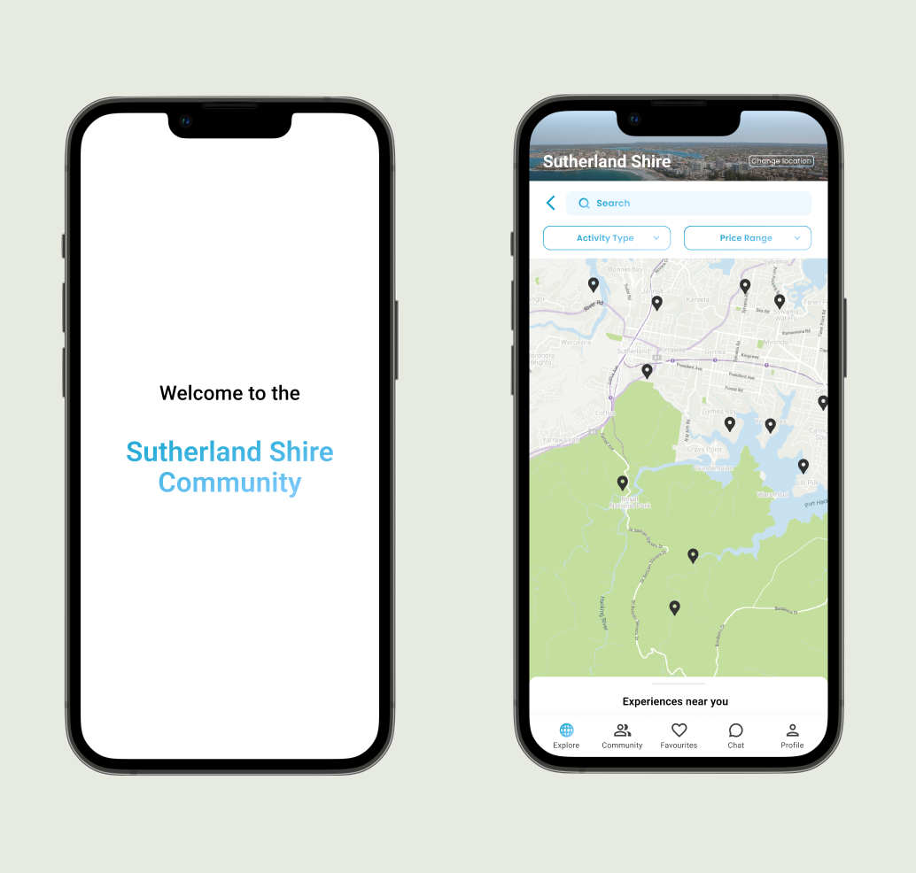
Our team made up of 3 UX designers, planned to create a mobile native app to encourage local suburb engagement and boost the area’s economy.
It will help residents to see what’s happening around them with ease by providing information about events and activities at ease by using functions such as filtering the postings so it targeted them specifically.
What might be the Solution?
What do I think?
Overall, I found it was a good but difficult challenge.
For me personally, I found the main challenge was to juggle the strong opinions and skills that each designer had. From this there became advantages and disadvantages within teamwork but it made us stronger as a team.
In regards to the MVP (minimum viable product), we only had just scratched the surface for the research and if provided more time I would like to focus on that more.
Full summary
Duration
Two weeks
Team and Role
Three colleagues tackled each task as a team rather than allocating different deliverables.
Design Methods
Design research
Business and market analysis
Heuristic evaluation
User interviews and surveys
Affinity mappingUser flows
Journey mapping
Archetype/s creation
Wireframes and prototyping
Usability testing
MVP
Tools
Figma
Mural
What was the problem?
There seems to be a separation between promoting awareness for the tourist and the locals.
During the project, we came up with the following problem that we wanted to hone down on the users perspective:
Users want to find a way to meet new people whilst supporting local businesses and contributing to the community but struggle where to find new people and keep updated on new happenings.This has resulted in the Community Contributors feeling disconnected from the community because they don’t know about the physical surrounding community.
What were our solution objectives?
Offer a native app where locals can see what is happening around them at ease
Users can feel a sense of community
Raise tourism economy within residents
Also can support local businesses
Design deliverables
Business Research
We underwent a lot of business analysis to get a scope as to what DNSW stands for and what their goals are as an organisation along with some background in the tourism industry.
What is it that DNSW is lacking in to include the residents?
For the period 2018-19 total tourism consumption reached $46.5 billion while in the next period (2019-2020) tourism consumption dropped to $37.1 billion. Which resulted in a $9.4 billion loss.
Market analysis
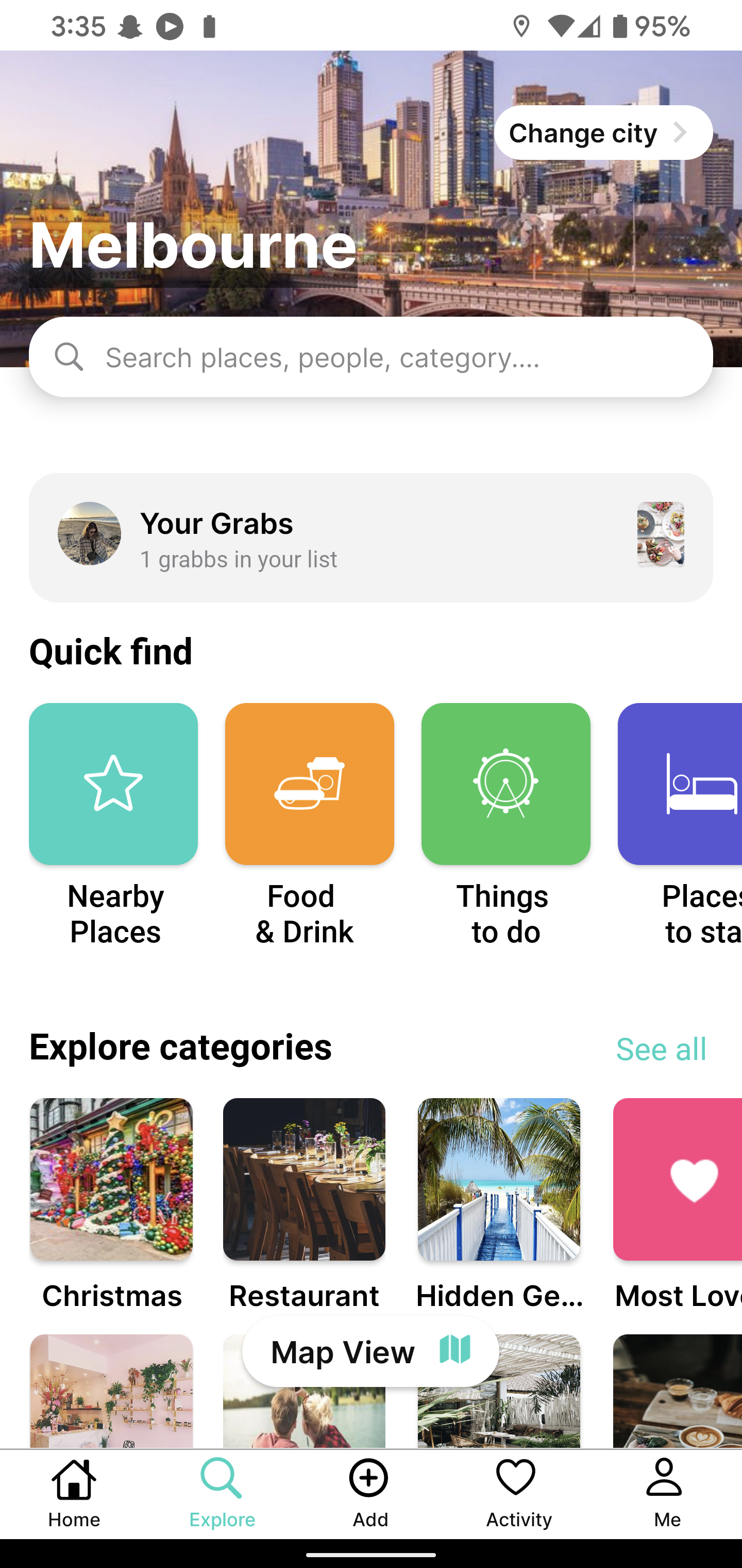
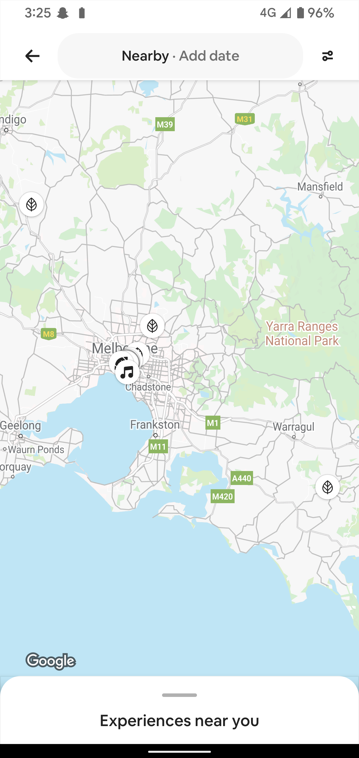
The competitor and comparators we looked into were Grabbd, social media (e.g. Facebook), nextdoor and Airbnb. We used these examples to take into consideration what functions and features we might add, especially nextdoor and Facebook as they promote a sense of community.
Journey Map
We put together a Journey Map showing the circumstances of a user navigating through the current VisitSydney/NSW (a third party website that is an extension of DNSW).
As you can see, it’s not necessarily a happy path. Their pain points occur when they don't know what they are looking for or going to other sites to find what they’re looking for.
Interviews and Surveys
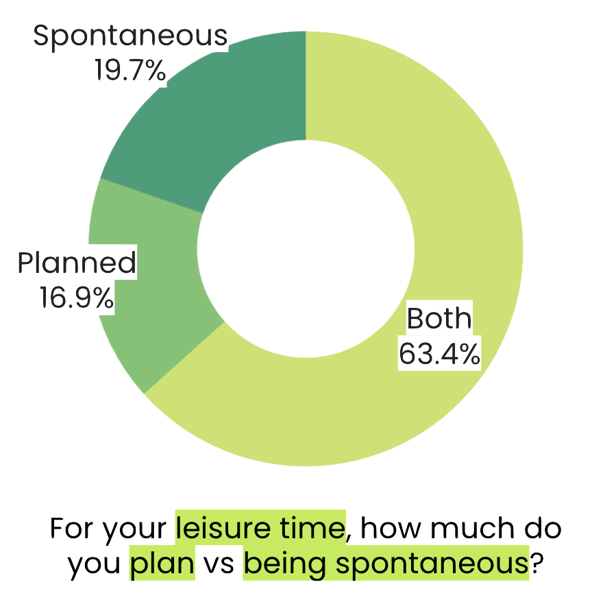
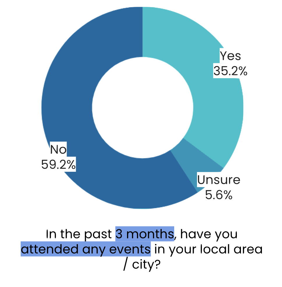
From the research stats, we felt comfortable to move onto preparing interviewing users and send out surveys to gather qualitative and quantitative data to get an understanding of how our users view their community.
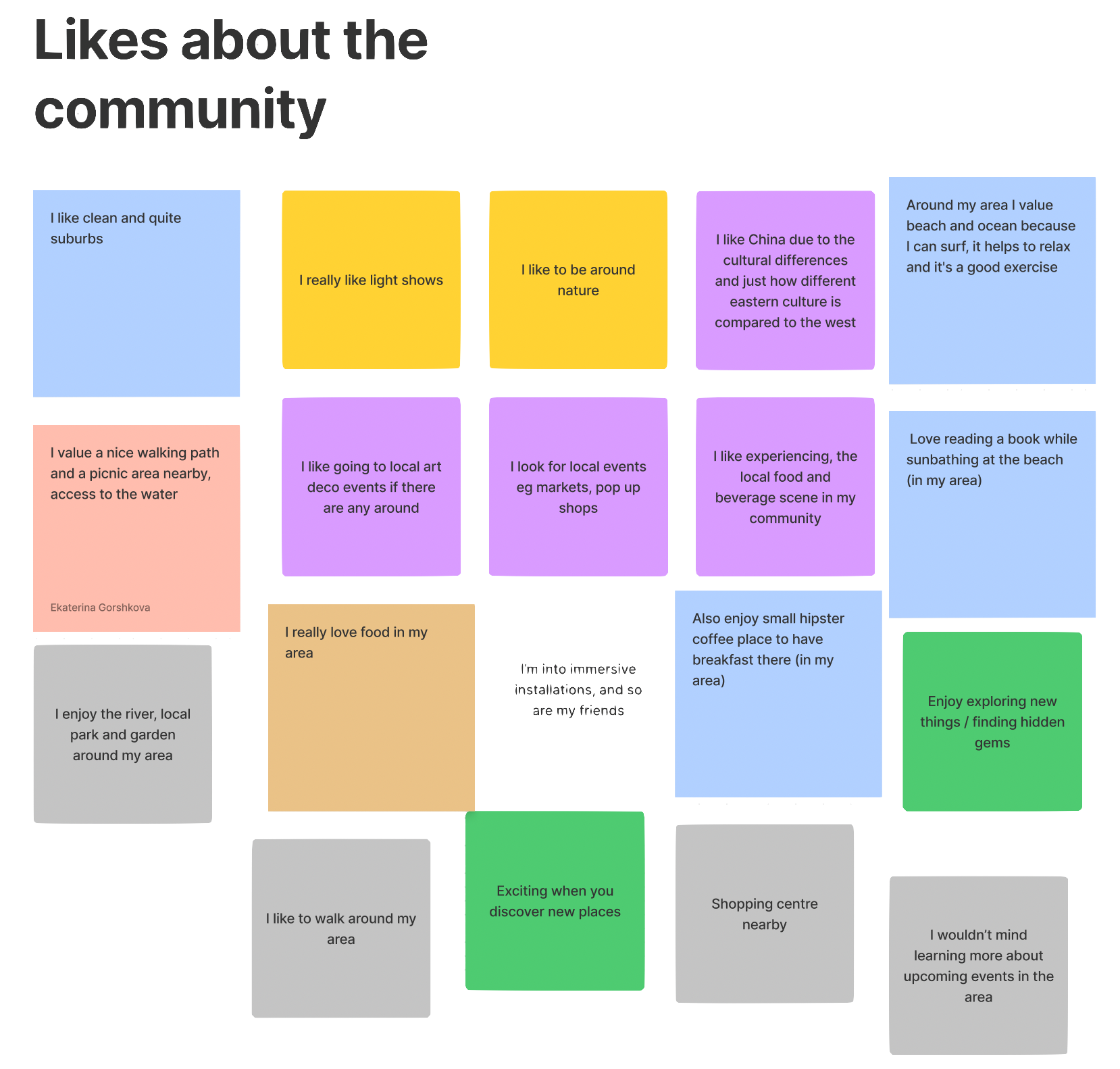
We interviewed roughly 8 people and received enough responses (from both interviews and surveys) to put together an affinity map.
Affinity Map
We correlated the responses and put them into category groups. We noticed there were a few trends that we focused on in more detail as we found it was very useful for our MVP (Minimal viable product).
Curious Cat
Enjoys finding new activities and meeting new people.
Spends less time planning things.
Doesn’t know where to find new events.
Archetype/s
From the noticeable trends in the affinity map, creating at least one archetype was necessary to start sketching our first MVP.
We came up with the following:
Community Contributor
Enthusiastic about sharing their knowledge with new people.
Supports small/ local businesses.
Needs to be comfortable in their environment.
Curious Cat
Enjoys finding new activities and meeting new people.
Spends less time planning things.
Doesn’t know where to find new events.
As you can see, the top three we chose are very similar since based off of our interview and survey results, they are very positive emotions.
We went with the Community Contributor (CeCe) as we thought it represented a lot of our ideas well towards who might be the target audience in this circumstance.
CeCe’s scenario
“CeCe has recently moved to a new suburb. They want to get to know neighbours and are eager to be involved within the community. They hear about local groups holding events such as voluntary beach clean ups and art classes from word of mouth but they’re unsure where to find more details.”
Early sketching
The three of us did a bunch of sketches that we think might be really helpful for our problem, even if it's just to show a specific feature or function. This really helped us to see if we’re all on the same page in regards to the solution.
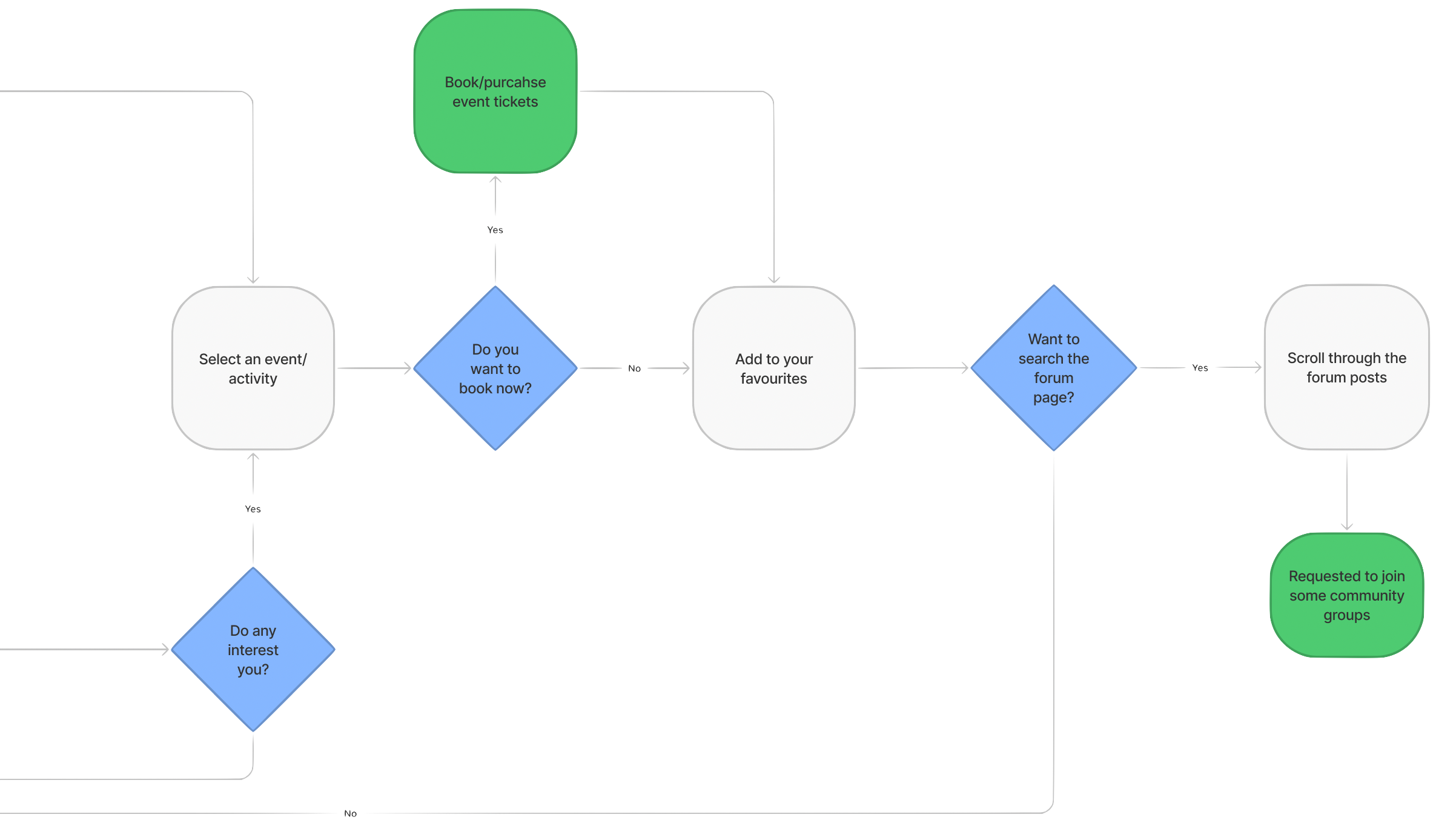
Userflow
The green outcomes show a ‘happy’ path in terms of the users experience we want to portray.
First round of Usability Testing
We prepared to start doing the first part of usability testing and getting feedback on the paper prototypes each of us made shown above.
From this feedback, the responses we received were a mixed bag. To the left, are the main responses we decided to hone down to update the prototype.
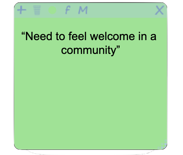
“Focus more on an LGA, rather than Sydney/NSW as a whole”
“Consider keeping the local businesses in mind”
Figma prototype
After absorbing the feedback we received, it was time to start making a digital prototype on figma.
My reflection and insights
Overall, I think this project was a good challenge and showed the power of teamwork. We agreed that instead of separating tasks between us, we helped each other work on each task and support each other. This was particularly helpful for our weaknesses or some methods one of us were not particularly confident in. There were some roadblocks along the way in regards to having different opinions on each end but we got through it and came out being exposed to discussions where we can hear each other out.
In regards to the MVP, I am happy with the wireframe. However, I think we only really scratched the surface in the research for the users and how to get a full understanding of the users to continue to use the app and contribute towards it.
If we had the opportunity to continue working on it, we would hone down on providing options for all target users including tourists if possible and figure out how content will get posted on the app in terms of looking at it from an admins point of view.
We’d hope to continue looking at the local business usability of the app and how it will or will not help with their business.
