What is Virtual Care and how is it used?
A lot of people know the term Telehealth, but are left stumped when trying to explain their understanding of Virtual Care.
Virtual Care supports all local LHDs and most health professionals for providing health care at ease in the comfort of their own home in many ways such as monitoring devices, check ups and media sharing with their doctor. This also avoids exposure to Covid-19 for thise who are immunocompromised.
Quick read summary
People who are wanting to learn more about Virtual Care and how to use it are left stumped when trying to navigate the webpage providing more information about the product and how to book an appointment. They’re unsure if Virtual Care is more of a concept or an actual platform they can leverage from the NSW Government site. There was also a lot of confusion around what type of health professionals offer the service such as therapists or GPs.
What’s the Problem?
What might be the Solution?
Our team made up of 1 Service Designer (myself), 3 Content Advisors and one Delivery Manager, made restructure and information changes to tie essential content in so people can find what they’re looking for more easily. This included added child pages and change of components to help people understand how to book appointments and get what the website is trying to tell them.
Throughout the testing process and discussing with my team about the feedback we received from usability testing, it was super clear what we were missing after most, if not all participants said they weren’t too sure what the next steps were in order to book an appointment. It was a big breakthrough for our team and realised it was sitting under our noses the whole time. It’s a great example to prove the power of usability testing.
What do I think?
Full summary
Duration
One month
Team and Role
Three Content Advisor
One Delivery Manager
One Service Designer (me)
Design Methods
Design research
Usability testing
Affinity mapping
Tools
Miro
Microsoft Teams
Confluence
Jira
What’s the problem?
Health is one of the biggest clients in Department of Customer Service NSW, There are a lot of LHDs (local health districts) to migrate onto the new platform and have them all on the same service as each of them are originally on different websites. It’s difficult to streamline this as the decisions from each LHD are different from the others. Some LHDs are on board with the proposed direction but others aren’t too keen without any valid reason.
From this, it’s difficult to keep information in one place without duplicating the same content for each LHD as Virtual Care supports a lot of these local health services. If the information is duplicated, it can also lead to confusion from content being contradictory between different sites. The consumer (being the public users) are left confused what to do next and the user journey would end pretty quickly as there were no more actions as to how to book or what to do if it sounds like something they would be interested in.
From this, I came up with a how might we statement to seek it in both a consumer and client perspective:
HMW build/design a one-stop-shop for Virtual Care that informs people how to use the service and give them useful content so that they can understand what the next steps are.
What are our solution objectives?
Since it was difficult to get all of the LHDs (16 of them) on board with the one-stop-shop site of all the information needed to support Virtual Care, the best scenario was to build the platform from the research gathered from testing and put together an admirable, easy to navigate ‘Hub’ with everything people need to know about Virtual Care and how to use it. We were still in the process of migrating the rest of the LHDs so we just needed to present it to the Virtual Care agency themselves to get approval and then try to get the remaining LHDs on board once they were ready to migrate. This proposed Virtual Care ‘Hub’ would be global on the NSW Gov site and then have all of the LHDs linked to the hub if people needed to find out more about Virtual Care. That way there are more access points for Virtual Care.
Design deliverables
Internal conversations
Having internal conversations about the initial problem we were experiencing was important to get an idea of other individuals opinions and can help steer the research in ways I hadn’t thought of before, these discussions were with coworkers who deal with the client more directly such as the Delivery Manager and Product Owner. Getting those insights and involving them helped gain more insight and easier proposals once it was time to present to Virtual Care.
Usability testing
The first thing we wanted to do was to test the site to gain feedback from the general public. Virtual Care had also requested for testing to be done before the site went go-live in case there was anything missing so it was reassuring that they were interested what potential consumers thought of their site.
6 participants were recruited for testing via Askable. Each session was no longer than 30 minutes long and it was done through MS Teams.
Each session needed to be recorded to help with the research in which a consent form had to be signed by each participant before starting the sessions.
The participant demographic ranged from ages 24-62 with a mix of genders as Virtual Care targets a wide range of consumers.
We tested 3 main pages to get an understanding of the overall content and navigation of the site. The pages being the homepage, ‘how to use Virtual Care’ and ‘About Virtual Care’. The participants were asked to look through the pages whilst answering questions as they navigated.
Affinity mapping
After finishing the Askable usability sessions, it became very clear even before I started putting together the map that there was no direction to take action on what to do next after reading through all of the content.
The three examples; how do I book an appointment/next steps, is VC a platform and what healthcare providers/services use VC, are the three main takeaways in terms of constructive feedback.
The main issue was the fact that people couldn’t figure out how to actually book an appointment. They were comfortable with the ‘About Virtual Care’ page however, when they looked through the ‘How to use Virtual Care’ page they expected to find out about appointments and how to book them.
The others that were identified is that people can’t understand if Virtual Care is just a concept that’s an umbrella for different platforms or an actual service. They were also unsure what types of health professions utilise Virtual Care.
Affinity mapping continued
There were also very positive feedback on Virtual Care. Majority mentioned how it suits all reading abilities and is educating about what it actually is since people hadn’t heard of the term before the testing session. They were more familiar with Telehealth.
They also found it straight forward to navigate through the child pages and find the information they were looking for (aside from the issues mentioned above).
Information architecture (IA)
After mapping out the responses and presenting them to my team, I got together with the Content Advisors to start thinking more broadly about how Virtual Care will will sit in NSW Health site. Like mentioned, there are many districts that offers Virtual Care, so they need to tie in together and ensure the user journey is in a sequence that works.
We have brought out a search service directory for NSW Health where people can search for a specific health service near them by using filters, tags and keywords to refine results. On these service/facility result point of interest pages (POI page) it will state whether the service offers Virtual Care and if so, it will take them back to the Virtual Care hub where they can learn more information.
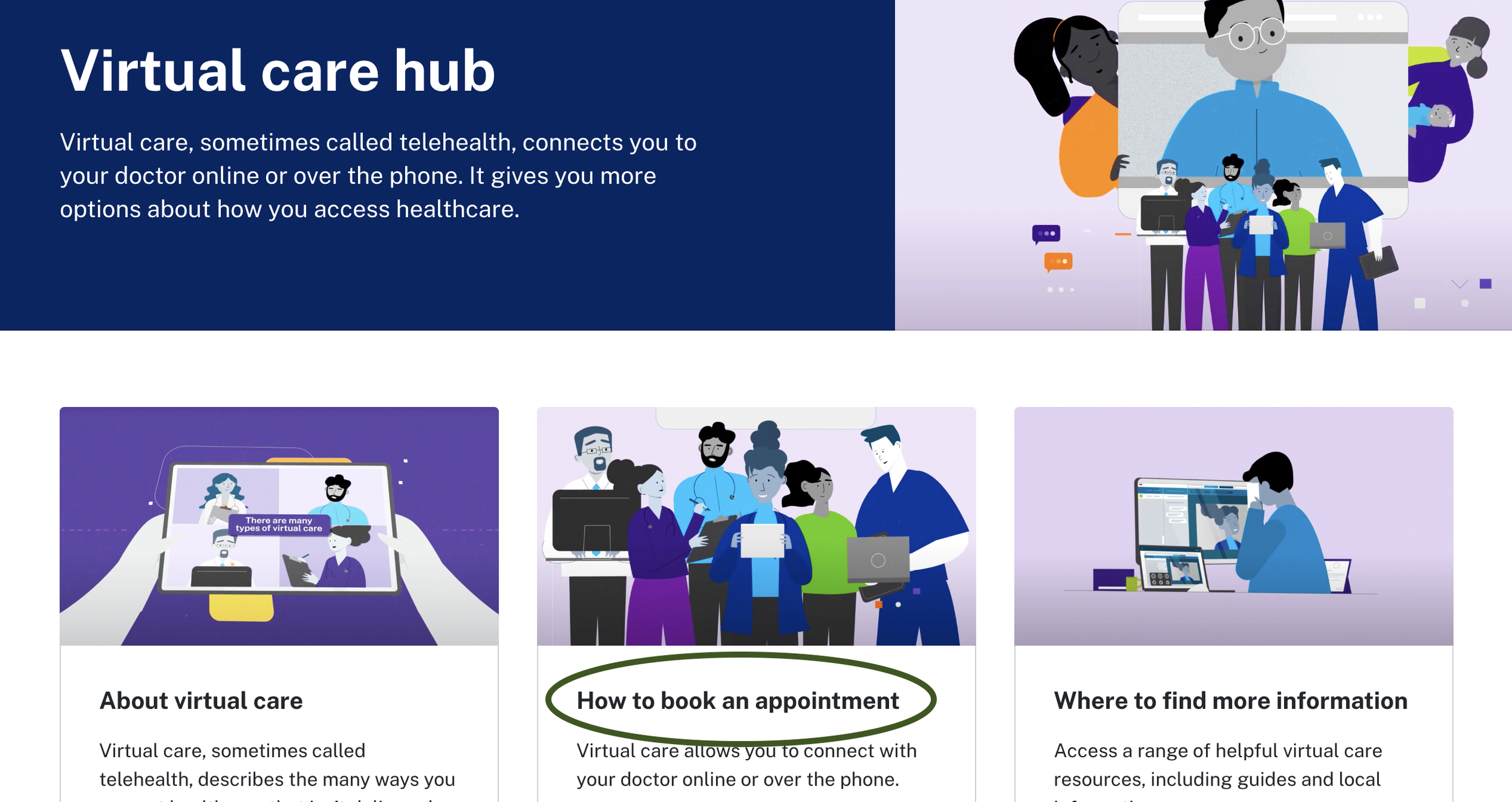
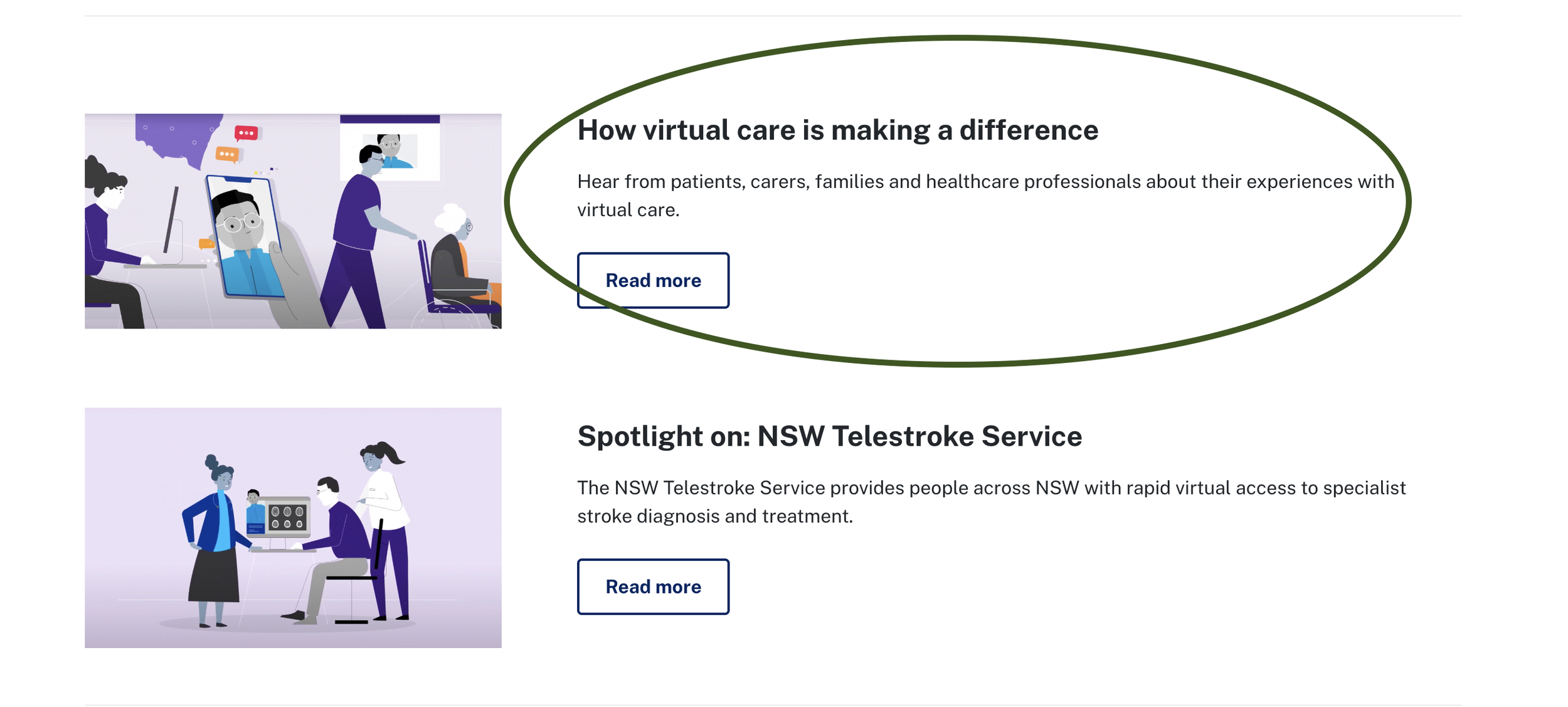
New content pages were added to the hub after finding the trends from the testing and we changed ‘How to use Virtual Care’ page to ‘How Virtual Care is making a difference’ and added a separate page called ‘How to book an appointment’ which has everything people need to know about the next steps. You can see these as an example below on the green level.
Page build and presenting
Once we had a clear understanding of what the issues were and how we would approach the change, we decided to make these tweaks on the staging site so we can provide a preview link for Virtual Care to have a look at and get approval before the website went live. We started with the research from usability testing and the structure of the information architecture (IA) as deliverables to the client so it painted a picture on what the public are saying and what our thought process was behind the proposals we were making.
Thankfully, Virtual Care were happy with the changes we have suggested and are on board with trying to streamline all of the LHDs on one platform. They weren’t hugely surprised with some of the feedback we received from the testing sessions.
The screenshots at the bottom are the changes we made to improve the user experience and to avoid less confusion. We made sure to highlight exactly what each page was trying to tell the user and made it in a way that it’s much less difficult to find things and is clear to know what they can do next to book an appointment.
Homepage (hub)
How to book an appointment
Bailey’s reflection and insights
I thoroughly enjoyed working on this project . It helped a lot to start easing into the idea of consolidating all of the global health information in one place. Since Virtual Care was on board and were happy with the proposed changes, it gives us a good leg up to proceed with the same for the remaining LHDs to migrate.
What would I do differently if I got given the chance to do it again? I would probably do a little more research on the site before jumping into testing so quickly. I was brought onto the project a little later after it kicked off and I would normally conduct a UX audit on the site to look what would need to be changed to match our design system and brand. I would have also liked to add more information about what services offer Virtual Care as that was another issue from the research but we targeted this more in the service search and state which health professional offers Virtual Care ties in that idea as well but there was an opportunity to have it in another child page within content such as the page ‘About us’.
I had a lot of fun working with my coworkers with this one, it was a time we were all in the office together so we spent most of our time discussing ideas and brain storming to come up with a well thought out but straight forward presentation for the client.


