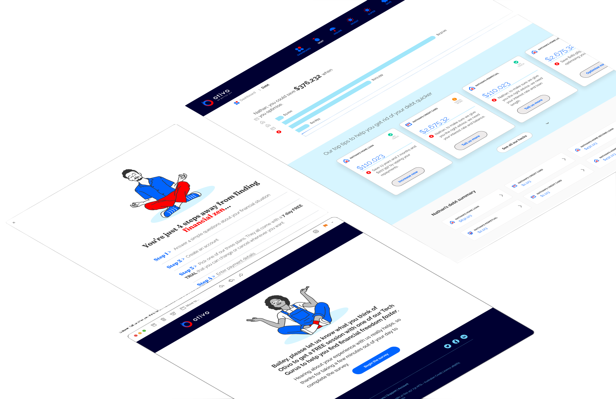
Strive for financial freedom
And fight off those onboarding scaries
Digital advice seems daunting to a lot of people in any industry from health to financial, sometimes it’s to do with trust, others it’s struggling to navigate around new technology.
Otivo provides digital financial advice to all Australians, anywhere, anytime. It is the first in the country to launch a fully online service of it’s kind. It offers products such as linking bank providers to get real time data, optimising suggestions for loans and super investment options and to keep up to date with insurance.
Quick read summary
What’s the Problem?
Otivo’s onboarding process provides no reassurance and comes across as ‘scammy’. People don’t trust the site enough to provide their personal financial details and they’re skeptical to link their bank providers through Otivo.
This causes people to drop off during onboarding or not returning to their profile after signup resulting in incomplete profiles and lack of gamification.
What might be the Solution?
While working along the tech team, it was clear that we needed to make a change to the flow so that Otivo can continue gaining more customers and the users are comfortable to continue using the platform.
I came up with solution objectives to ensure people it won’t take long and that linking your bank provider is not as scary as it seems.
This involves small features such as navigation indicators and telling people how many steps are involved to sign up and providing as much information about our security as possible without making it overwhelming. Lastly, enhancing the user control was a big thing as well when it came to exiting the flow.
What do I think?
Although it seemed as though some of the changes would be obvious once the project was in its final stages, it was a challenge for me leading this project as a sole UX designer for the first time.
As it was my first project in my career outside of study, I gained a lot of knowledge and confidence by jumping in the deep end and fully immersing myself in the work while also learning how to communicate and liaise with the developers and CTO.
I personally think that the improvements made to help both the users and the business was a success as data showed more people were completing onboarding and visiting Otivo more frequently.
Full summary
Duration
Two months
Team and Role
Myself being the sole UX designer and working closely with developers, CTO and CMO
Design Methods
Design research
Journey map
Market analysis
Surveys
Usability testing x2
Affinity mapping
Wireframe and prototyping
Tools
Whimsical
Figma/figjam
Surveyking
What was the problem?
We were wondering why there had been a lot of new users not completing the whole onboarding process from the first initial ‘sign up’ button to filling in their personal financial details. They would drop off either when they were asked if they wanted to link their bank account or after the sign up process and was taken to their personalised dashboard. There would be inactivity from the user afterwards.
From this, I came up with a problem to seek it in both a customer and business perspective:
People are intrigued when it comes to digital financial advice so they sign up to get more details about what the product offers, but instead, they are faced with uncertainty and the expectation of reassurance is lost. This has resulted in incomplete profiles and lack of desire or liability to continue using Otivo.
What were our solution objectives?
Adding more reassurance in the sign up process so people feel comfortable to complete onboarding and continue using Otivo regularly. The overreaching solution is knowing people feel like Otivo helps them get a good understanding of their financial wellbeing.
Also promoting Otivo and what we do more on the homepage so that people don’t find the need to look for those answers during signing up.
Design deliverables
Market analysis
I underwent some market analysis to see what others are doing in terms of helping users go through onboarding in a smooth and intuitive way while also providing reassurance. The ones that stood out to me the most were the famous Duolingo and Canva. They show great representations to help users during the sign up process and getting started.
Journey map
The journey map shown below shows that it is a rather unhappy path the more they continue the onboarding process. The main pain points are not trusting Otivo enough and no indication of how long it takes. Impatience starts to kick in.
Surveys
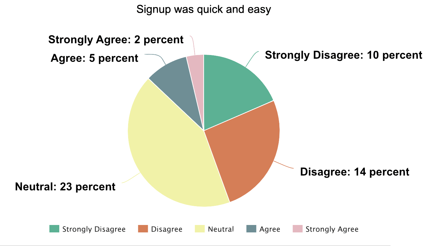
Since identifying the problem and using the journey map as a visual representation to communicate the problem to my wider team, it was time to get validation from new customer quantitative data. I set up a new user survey, with the help from developers, so the system will trigger an email to the chosen email address a new user would sign up with. This survey will have a link embedded into the email so that people can answer the questions at ease. This survey was sent 2 days after sign up so it gives them a chance to play around with it before answering truthfully.
As you can see, majority of the results were not a fan of our onboarding procedure.
Some graphs of a set of answers we received:
Usability Testing (aka - Tech Guru sessions)
Myself and our certified Financial Planner held Zoom chats video calls with our current customers called ‘Tech guru sessions’. These really stuck out to the users as it gave them a chance to get financial assistance about their Otivo profile in person rather than a few calculations and suggestions the website brought up.
At the same time as these sessions, it was very helpful for me to sit in on the calls and go through anything they needed help with in any stage of their account creation regarding the interface. This also gave me the perfect chance to go through anything I needed feedback on.
We offered the guru sessions to those who completed the survey and who were struggling with the platform overall. They were frequent overall through my time at Otivo but we spoke to roughly 5 people regarding the onboarding experience. There were no specific demographics that we targeted for these sessions, just people who had newly signed up or had their profile for a while since we launched in February 2022.
From these responses, I created a affinity map for the onboarding questions at the time.
Affinity mapping
I’ve picked out a couple of trends that were relevant to the problems we were experiencing with onboarding from our Tech guru sessions. The affinity map was created in Figjam.
Final prototype
The final prototype included multiple new features and change of language.
The main feature add-in was the modal to the left, it states exactly what they will be doing during the sign up process and assures them that it’s quick and easy.
Above, adding small but impactful features such as the progress bar at the top for indication how far along they are in the flow and showing how many more questions they need to answer on that page as more questions become interactive when ‘next’ is clicked.
Finally, adjusting the language when they hit the link provider modal. Stating clearly that it is not harmful and that they can opt to manually input if they wish to do so to ensure user safety.
My reflection and insights
In the amount of time I had for the project to complete in 2 months as a sole UX designer working with a busy team of developers and other projects alongside this, I personally think that the enhancements made to the onboarding process were significant and effective.
Sure, it came with challenges and restraints such as learning other aspects of the new role I was in. I was assigned this task as soon as I started with Otivo so it felt overwhelming having to absorb so much information at the same time as managing this project. It felt as though I was chucked in the deep end and it was a sink or swim situation, especially being in a tech startup, everything was happening very quickly, but I managed to swim thankfully and learnt a lot of new swimming techniques along the way. If I were to do this project again at the stage I was in at Otivo, I would prefer if I had a swimming instructor to help guide me over the waves.
As for the work, we got less complaints regarding onboarding after the adjustments were made from the proposed prototypes. Some things that I would’ve done differently if I had the chance to was to add an exit path to the above modals, even if we had some people who wanted to escape in which there are some people who will do that in any situation. An easy ‘x’ button on the top left would do the trick and to take them back to the homepage.
Another is to add more contact forms or buttons in a couple of the modals, just to let people know that we’re there to help them if required.
Lastly, a very specific one, is to add a link to Basiq information on the linked accounts modal. Basiq is the product we collaborated with to pull information from linked providers and has correspondence with the majority of Australian banks to make this happen. I think it would’ve helped people trust the idea more if they were explained how it was done and why we used Basiq.
Overall, this process was constantly looked at by me over the time I worked for Otivo. If I had more time and resources, I would have also provided more specific help tools after signing up and taken to their dashboard by looking at what Duolingo and Canva do. They continually have tools like these to help their users navigate through their profile.


